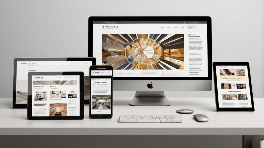
When you hear people talk about websites these days, the term “responsive website” comes up a lot. But what does it actually mean?
A responsive website is a site that adjusts itself to look good and work properly on any device, whether you are on a phone, tablet, laptop, or desktop computer.
Instead of building a different website for every device, a responsive website automatically reshapes itself so that it stays easy to use no matter the screen size.
If you want your site to feel modern, professional, and user-friendly, making it responsive is essential.
Table of Contents
ToggleWhy Responsive Design Matters
More people now browse the internet on their phones than on computers.
If your website is not easy to read or navigate on a mobile screen, you are likely to lose visitors quickly.
Here is why a responsive website matters:
Better user experience: Visitors stay longer when your site looks good and is easy to use.
Higher search rankings: Google gives preference to mobile-friendly websites.
Faster loading times: Good responsive designs often load quicker, which helps with SEO and keeps visitors happy.
Consistency: Your brand looks professional across all devices.
Cost-effective: Instead of maintaining multiple versions of your site, you manage just one.
If you ignore responsiveness, you risk frustrating users and damaging your online presence.
How Responsive Websites Work
A responsive website uses flexible layouts, images, and CSS (the language that controls style) to adapt to different screens.
Here are the main ways it works:
Fluid grids: Rather than fixed widths, page sections scale in proportion to the screen.
Flexible images: Pictures resize automatically to fit smaller or larger spaces without losing quality.
Media queries: These are small bits of code that tell the website how to adjust based on the device’s screen size.
Examples of Responsive Design in Action
Imagine you are looking at a café website on your laptop.
You see a big photo of their food, their menu, and their contact details neatly laid out.
Now you open the same website on your phone. The big photo becomes smaller to fit the screen. The menu turns into a simple drop down. The text is still easy to read without having to pinch and zoom.
That is responsive design doing its job.
It feels seamless, like the website was made just for your device.
How to Check if Your Website Is Responsive
If you already have a website and want to know if it is responsive, here are a few easy ways:
Resize your browser window: If you shrink your browser on a desktop, the website should adapt smoothly.
Use online tools: Google’s pagespeed insights Test is free and tells you if your site works well on mobiles.
Try it on different devices: Look at your site on your phone, a tablet, and a computer.
If your website does not adjust properly, it might be time to update it or choose a more mobile-friendly theme.
How Templates and Themes Help with Responsiveness
Most modern website builders and content management systems like WordPress, Wix, Squarespace, and Shopify offer responsive templates and themes out of the box.
This means you do not have to design a responsive site from scratch.
You simply pick a well-made template, customise it with your colours and content, and the responsiveness is already built in.
When choosing a theme, always check if it specifically says “responsive” or “mobile-friendly” in the description.
For more information about templates and themes check our post all about it.
Mobile-First Design vs Responsive Design
You might also hear the term mobile-first design.
It means designing your website starting with mobiles in mind, then working up to tablets and desktops.
While responsive design adapts to all screens, mobile-first design focuses first on making the mobile experience excellent, because that is often where most visitors come from.
Both approaches are valid. The key is to make sure your site is brilliant on small screens, not just “good enough”.
Common Mistakes to Avoid with Responsive Websites
Even if a website is technically responsive, there are still mistakes that can spoil the user experience. Look out for:
Tiny buttons: Hard to tap on small screens
Text too small: Users should not have to zoom in to read
Slow loading: Large images can drag mobile speed down
Hidden menus: Make navigation simple and easy to find
Content overload: Cramming too much onto a mobile page can overwhelm visitors
Always test your website thoroughly and simplify wherever you can.
Responsive Design and Accessibility
Making your website responsive also plays an important role in website accessibility.
Many people with disabilities use mobiles or tablets to browse the internet.
A responsive site:
Makes it easier for people who use screen readers or assistive technologies
Supports users who rely on keyboard navigation
Reduces cognitive load by presenting information clearly
By focusing on responsiveness and accessible practices like good contrast ratios, large tappable areas, and clear labels, you are creating a site that welcomes everyone.
If you want to build an inclusive layout that respects all users, responsiveness is non-negotiable.
Future Trends in Responsive Design
Technology keeps evolving. In the future, we will see websites needing to adjust to even more devices like smartwatches, smart TVs, and even virtual reality headsets.
Good practice now includes:
Flexible design thinking: Assume screen sizes will continue to vary
Prioritising speed: Fast sites will continue to perform best
Touch-friendly layouts: Think beyond the mouse and keyboard
Minimalist styles: Clean, uncluttered designs work better across all devices
The main idea remains the same — design for humans, not machines.
🧠 Final Thought
A responsive website is no longer a nice-to-have, it is essential.
It ensures that your site works for everyone, on any device, at any time.
By choosing responsive templates and themes, testing your design on multiple devices, and keeping your user experience front of mind, you will create a website that feels modern, trustworthy, and easy to use.
Remember, your visitors are just a tap or swipe away from choosing your service, making a purchase, or learning more about you. Make sure you welcome them properly, no matter how they arrive.